Streamlining Dashboard Design
for Accountants
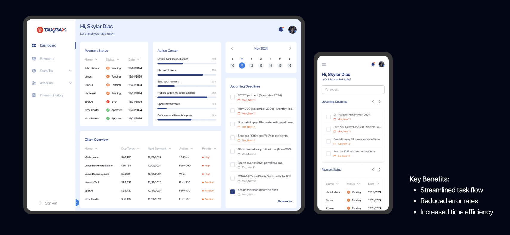
The project delivers a user-centric dashboard that simplifies complex financial data, enabling quicker decision-making and improved workflow efficiency.
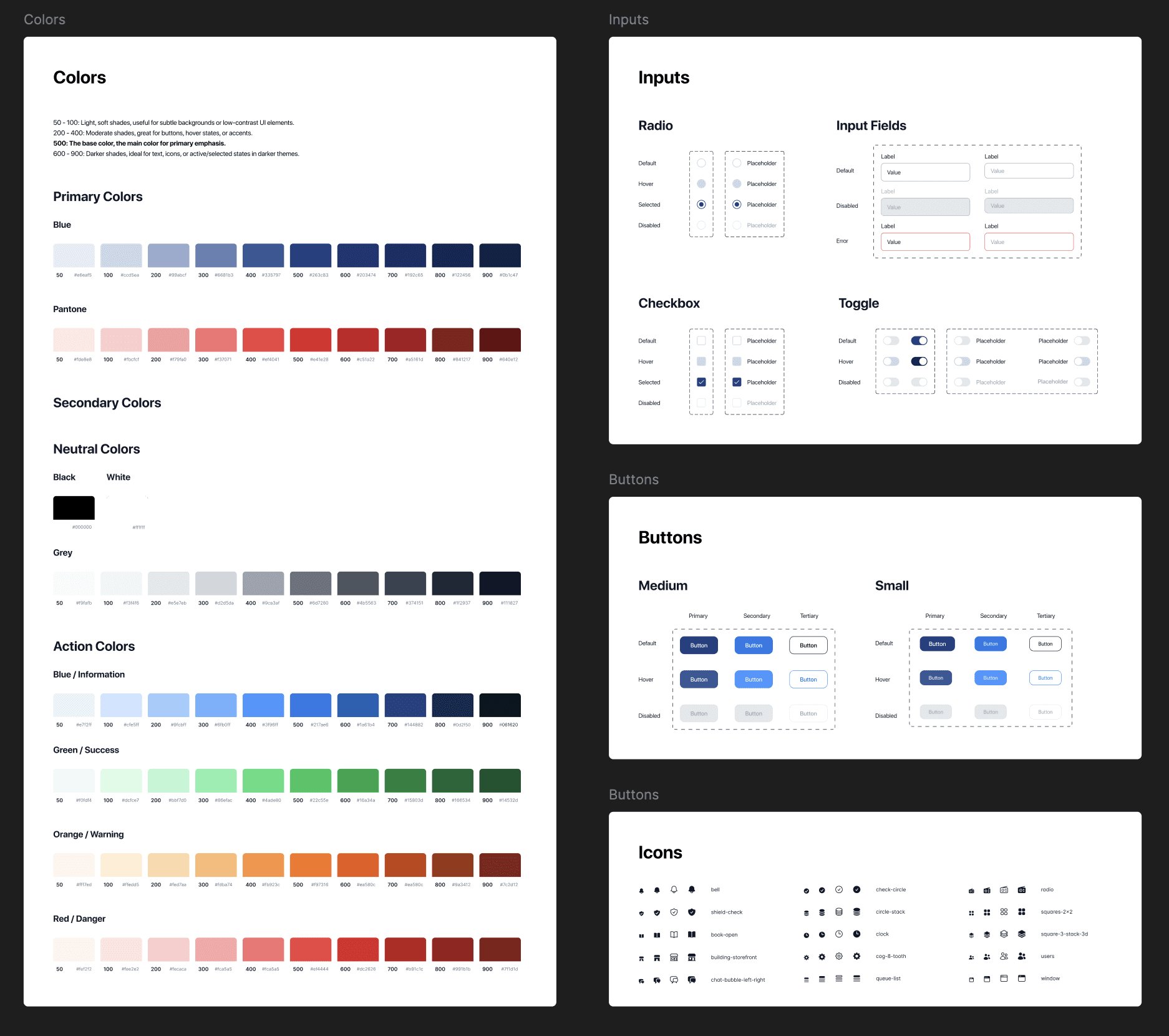
Design System
Dashboard Design
Responsive Design
15 Days
Role
Product Designer
Client
TaxPay AI
Team
Individual Project - Design Sprint
Challenge
Accountants face challenges managing multiple clients' tax data, leading to information overload and difficulty prioritizing tasks, while ensuring clarity and usability in displaying complex information like deadlines and payment statuses.
Solution
Ensure responsive design for seamless adaptation across devices, keeping key features like the Action Center and notifications easily accessible.
Taxpay's Strategic Goals
Purpose
To design a dashboard interface that enables accountants to efficiently manage and pay taxes on behalf of their clients.
Strategic Goals
Improve the user experience by streamlining tax management tasks, reduces errors, and saves time.
Understanding The User Needs
Who are we building this for?

What are we building?
To ideate the components for the dashboard, I began by understanding the core needs of accountants, such as managing multiple clients, tracking deadlines, and monitoring payment statuses. I conducted research on common pain points, like information overload and inefficient task prioritization, and mapped out key workflows.

Wireframing and Lowfidelity

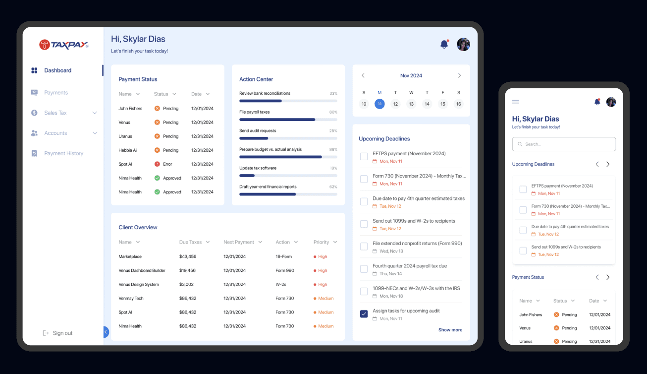
Introducing TaxPay AI's Revamped Dashboard
Improved user experience by making tax management tasks straightforward, reducing errors, and saving time.
Design System
Iteration 1

What Worked
01
The layout and sections in the dashboard were effective in organizing content and enhancing usability.
02
The font sizes were well-chosen, providing clear readability across desktop and mobile views.
What Didn't Work
01
Splitting the tasks and upcoming deadlines into two separate sections was unnecessary; instead.
02
There wasn’t enough emphasis on priority and status colors, which made it harder to quickly identify urgent tasks or important updates.
Iteration 2
A dynamic, sortable table displaying client name, total due taxes, and next payment deadline with quick actions, filters, and color-coded overdue indicators.
An interactive calendar with month/week views, color-coded urgency indicators, clickable events for detailed info, and calendar app integration.

Final Dashboard
Collapsible Side Bar
Success Metric
01
Track user engagement through increased usage rates of dashboard features by measuring reduction in time spent managing client taxes.
02
Monitor error reduction with fewer missed deadlines and overdue payments. User satisfaction through feedback from accountants.
Design Next Steps
01
Create a high-fidelity mobile prototype incorporating context-sensitive menus, and redesigned data visualizations
02
Analyze results and iterate on the design to address any usability issues or user preferences identified during testing
This is just a part of the story…
Reach out for more on this project!