Redefining Mobile Banking with
HDFC’s Next-Gen App
The redesigned HDFC app combines user-friendly interfaces, streamlined transactions to deliver a seamless and secure banking experience for all users.
Finance
Mobile
SaaS
1 Month
Role
Product Designer
Client
HDFC Bank
Team
Individual Project
Challenge
The HDFC mobile app had a cluttered interface, complex navigation, and limited accessibility, making tasks like transfers and payments cumbersome. It lacked inclusivity and modern design, impacting user experience and trust.
Solution
The revamp introduced a user-friendly, intuitive interface, streamlined banking tasks, and improved accessibility for diverse users. Enhanced security and a modern design ensured a seamless, secure, and engaging experience.
The Need for a Redesign
Frequent use of the HDFC Bank app revealed significant challenges in performing basic tasks like accessing transaction history or locating card details. These tasks were time-consuming and cumbersome, causing frustration and inconvenience for users.
78%
of surveyed users reported difficulty in finding key features like transaction history within the app.
2.5m
spent basic tasks which could be reduced to under 30 seconds with a streamlined design.
Critical Workflows in the Redesign Process
This is how the old design looked and where users faced challenges

I divided my approach into two phases
01
Conducting research on the product, its users, and competitor analysis to identify needs and opportunities.
02
Executing the design process through ideation, information architecture, wireframing, and establishing metrics for testing and validation.
For Whom?
We categorized our users into two key groups: senior citizens and millennial students, representing opposite ends of the user spectrum. This approach ensured the solution was inclusive and accessible, catering to the diverse needs of all users.

Millenial Student
@devangbheda

Senior Citizen
@kirththakker
As a senior citizen who prefers simplicity
I want to easily navigate the app and perform basic tasks like checking balances
So that I can manage my finances without stress or confusion
Through user interviews, I discovered that the core journey is the transaction process, which must be prioritized and refined to deliver a seamless and intuitive experience.
Understanding the money transfer journey
I mapped out the entire journey from initiating a transfer to confirming the transaction and identified opportunities to streamline the process.

Few Key Insights That Informed My Design Decisions
01
Streamlining access to key features like transactions and account details was essential.
02
Millennials wanted advanced features like budgeting for smarter financial management.
03
Reducing steps, adding real-time validation, and enabling saved beneficiaries can boost usability and trust for all.
04
Both groups prioritized secure transactions and data protection, requiring robust security measures.
How might we
create a more intuitive, secure, and personalized experience, enhancing user satisfaction and driving engagement?
Revamped Design
The design approach for the dashboard prioritizes simplicity and clarity. By minimizing distractions and reducing visual clutter, the interface allows users to focus on their primary objectives.

Design Language
I chose the Lato font family for the redesign. The primary color palette of blue and red is derived from the logo.
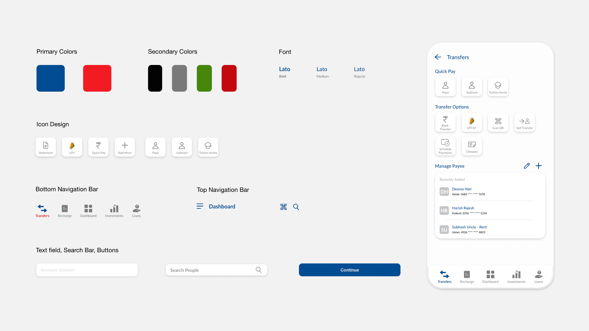
Dashboard Design
The dashboard features a clean, minimal design with bottom navigation for key tasks like transfers, bill payments, investments, and loans.

Redesigned Money Transfer Journey
I chose the Lato font family for the redesign. The primary color palette of blue and red is derived from the logo.

How are we cutting product development time?
Increased Task Efficiency
80% of users completed money transfers 40% faster with the redesigned journey, thanks to fewer steps and clearer navigation.
Enhanced User Satisfaction:
90% of users reported higher satisfaction with the new dashboard and easy access to frequent tasks like transfers and bill payments.
Reduced Errors:
Real-time validation and progress indicators in the money transfer process reduced errors by 60%, ensuring smoother transactions.
This is just a part of the story…
Reach out for more on this project!